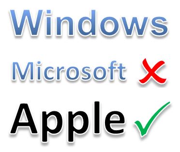
It’s official: Apple has windows, Microsoft doesn’t
Microsoft has ditched the window metaphor in order to make its OS feel like a mobile app, but Apple’s desktops, tablets and phones all still use a window metaphor
Reverse gamification’s next big test? Windows 8 Metro
Here’s concrete proof that Windows 8 is a puzzle that its intended users cannot solve unaided. Reverse gamification suggests that ultimately, this fact probably won’t make the slightest difference to its prospects for success
Reverse gamification
Puzzles are (deliberately) bad user interfaces. We’re told to love the look of things which have ‘invisible’ interfaces, because designers love simplicity. Hide those countless features, make it look simple. But this turns things into games with hidden rules. Not everyone wants to play.
Rather go blind? UI enables user to EXCEED his sighted efficiency
Justin Romack’s demo has to be slowed down quite a bit for us sighted folks watching the video
Gimmicks: innovation gone wrong, or just critics being rude and short-sighted?
When we call something a gimmick, we’re describing a feature which seems unimportant to us. But we can be so very wrong
You may not be a Web designer, but…
It might just be useful to see the world from their perspective: this video does quite a good job of conveying their ultimate ‘nightmare experience’: the dreaded Design Review with the client
Underwhelmed by interfaces? Want to see what’s coming next?
Spielberg’s ‘Minority Report Interface’ guru tells us all what he’s been working on


