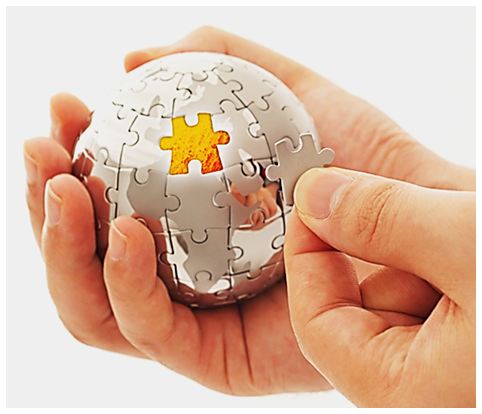
Puzzles are (deliberately) bad user interfaces. We’re told to love the look of things which have ‘invisible’ interfaces, because designers love simplicity. Hide those countless features, make it look simple. But this turns things into games with hidden rules. Not everyone wants to play.
Here’s a classic caricature of a ‘gamified’ user interface:
a d v e r t i s e m e n t
Is your startup accelerator in trouble?
- is the whole thing starting to look like a ‘one hit wonder’?
- were the applicants below expectations?
- are you feeling out of your depth?
- is the schedule beginning to look unrealistic?
- are you beginning to feel that you ‘went native’ with the founders’ optimism?
You’re not alone
You need to talk to us
We’ve been studying startup accelerators
It turns out these problems, and a whole lot more, affect all accelerators in their early stages
They can all be put right
In case of fire, use hammer, break glass.
Locate hidden hammer, win prize!
Can’t find hammer?
Sad day for you!
The designer, when confronted with the requirement to redesign a consumer product with a cluttered arrangement of perplexingly numerous features crammed into a small space, jumps for joy.
So much to simplify, so simple to improve.
But all they will do, is take the visual confusion that results from ‘functional overload’ and turn the product into a mysterious game whose rules are nowhere to be seen.
Going out of my sight, going out of my mind
The puzzle-receptive mind loves this. For it, a relatively feature-free, seemingly unresponsive object that they know is meant to do much more than it seems to ‘want’ to do is not intimidating or discouraging: it’s an irresistible challenge.
Touch, press, shake, twist, turn, listen, watch, feel… keep trying different things until something happens, then see if you can make it happen again, or stop it, or change it, or take it back to the way it was: the more of this ‘exploring’ that they have to do without seeing any genuinely useful results, the less likely any self-respecting puzzle-freak is going to give up before something practical and constructive happens.
For the rest of us, we need some clues. Something (or someone) has to give us a reason to believe we aren’t just wasting our time with some obstinately unforthcoming piece of junk: if nothing obviously productive or intelligible happens when we try to make it work, we tell ourselves:
- ‘it probably doesn’t actually do anything’
- ‘it’s probably broken’
- ‘I wouldn’t want one if it’s that hard to use’
- ‘I want something a bit more straightforward’
Not all of us are happy wanting everything to be a game. Not everyone thinks that if things are really obvious, they are an insult to our intelligence.
So is this, in terms of hardware, the difference between Apple and Windows? Apple is often seen as being seriously into minimalism, Windows isn’t. Except, have a look at the new Windows (8) Metro interface.
Is the puzzle epidemic spreading?
So the new puzzle is this: how do we deal with the fact that the tidal wave of new features that we want our products to have, shows no sign of abating?
How do we stop products either wiping the user out in a blizzard of buttons, icons, labels and controls, or leaving them utterly mystified and intimidated by a seemingly inert and featureless work of conceptual art that only springs into life (or does what you want and expect it to do) when you deftly execute some cleverly concealed manoeuvre?
It turns out that social media may provide the answer to this, but it may also be part of the problem.
A puzzle is not a puzzle, once you have solved it.
Once you know your way in, even if you have to go through a byzantine maze of complexity to do it, you eventually stop thinking of the maze as a puzzle and it becomes nothing more than ‘the way in’.
If the puzzle solver provides the solution (perhaps preceded by a courteous ‘spoiler after the link’ disclaimer) to their friends on social media, none of their friends will ever need to try to solve it.
And if the puzzle is not something that the product manufacturer would feel needs to be shrouded in secrecy (and ‘how to use a device with a minimalist UI’ is something they are unlikely to want kept secret) you’ll soon find that the ‘how to’ for using just about every feature, no matter how unintuitively implemented, becomes easily found on Google.
So maybe social media (and eventually just searching the web) makes puzzling UIs less bad.
But the problem with that, is that manufacturers and designers recognising it and depending upon will make puzzle-based UIs much more ubiquitous.
The gamification of products, and our expectations of them, may make for a more ‘challenge-receptive’ culture, but it potentially excludes those who find puzzles irritating, inconvenient, alienating and inhibiting: social media itself is actually a bit like that, a fact which illustrates the point that social media is potentially the ultimate ‘UI gamechanger’ because it deploys a feedback loop which is so powerful and pervasive that it successfully overcomes the shortcomings of its own UI.
Why should we care?
Well, unless we start considering how to go about reversing, mitigating, or remediating the impact of this ‘defaulting to gamification’ trend, or at least try to find out how to counterbalance it with a sensitivity towards catering for the needs of the uninitiated or gamophobic user, we are going to risk having instances of the ‘hidden hammer problem’ that I showed at the top, with potentially undesirable consequences.
Or am I seeing a problem (or a puzzle) that isn’t really there?


